
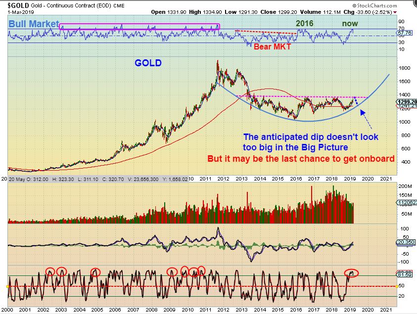
March 2nd -The Weekend Report
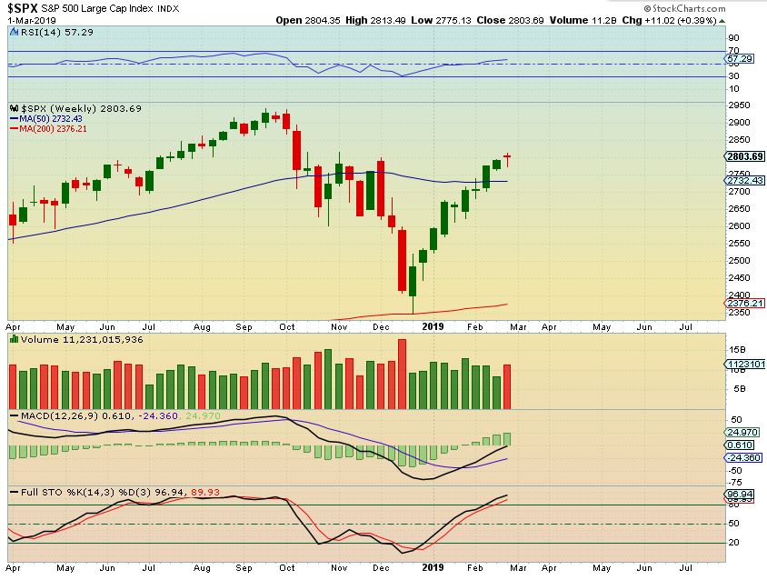
SPX WEEKLY – This V-Bottom has had 9 straight weeks higher , so riding a loose stop has worked out. When I look at this chart, it doesn’t look like a dcl has occurred yet, but I’m not going to worry about that right now. If you are long , a stop under the 200sma on a daily chart would be fine, or tighter if you wish. Let’s look at the daily chart…
.
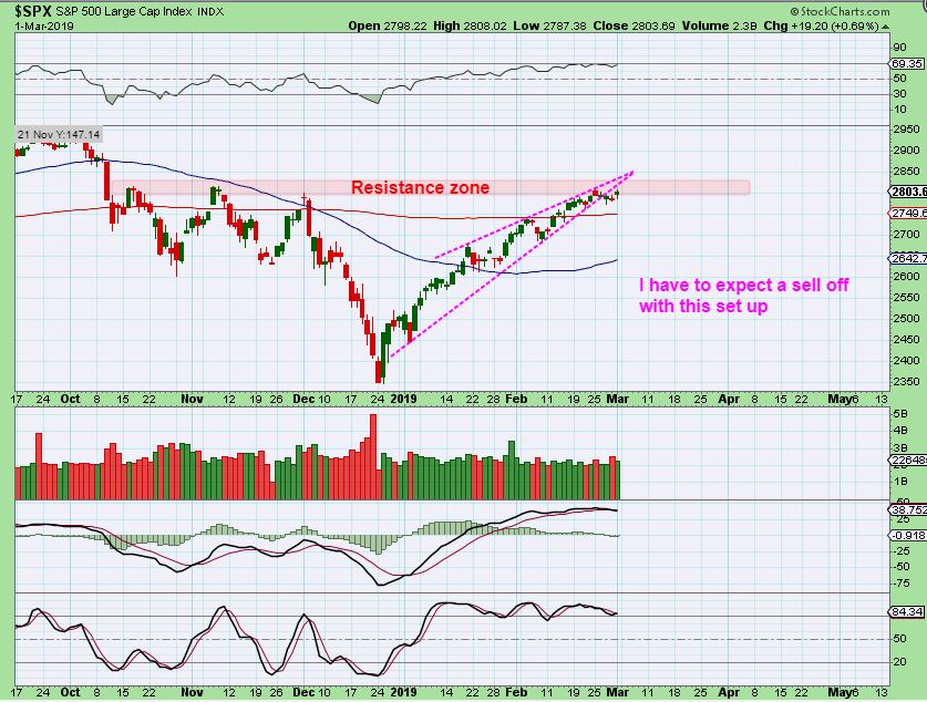
SPX DAILY – As Bullish and die-hard as things seem, I just have to expect a sell off soon with this type of a wedge set up. Once that sell off got going in October to Dec, it really gained downward momentum, so I would be patient if this sell off starts and allow it to play out, because…
.
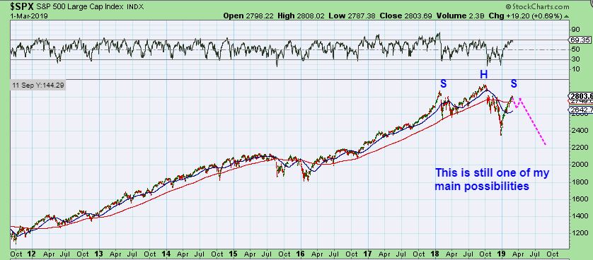
SPX – Remember that this was one of my main ideas after we get a bounce / rally / recovery from the lows. This idea is still a possibility in the Bigger Picture. It has been a mixed picture during the earnings season, with both Good and bad.
.
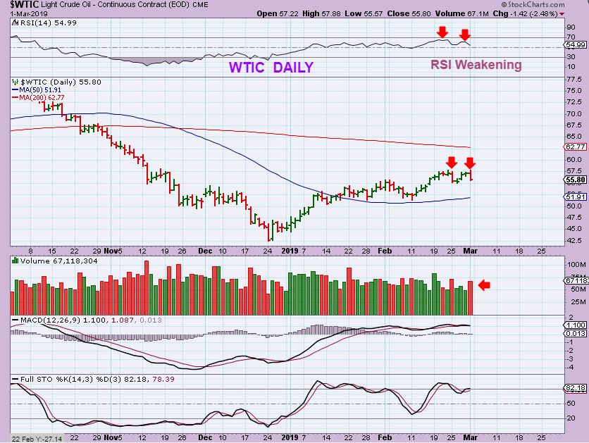
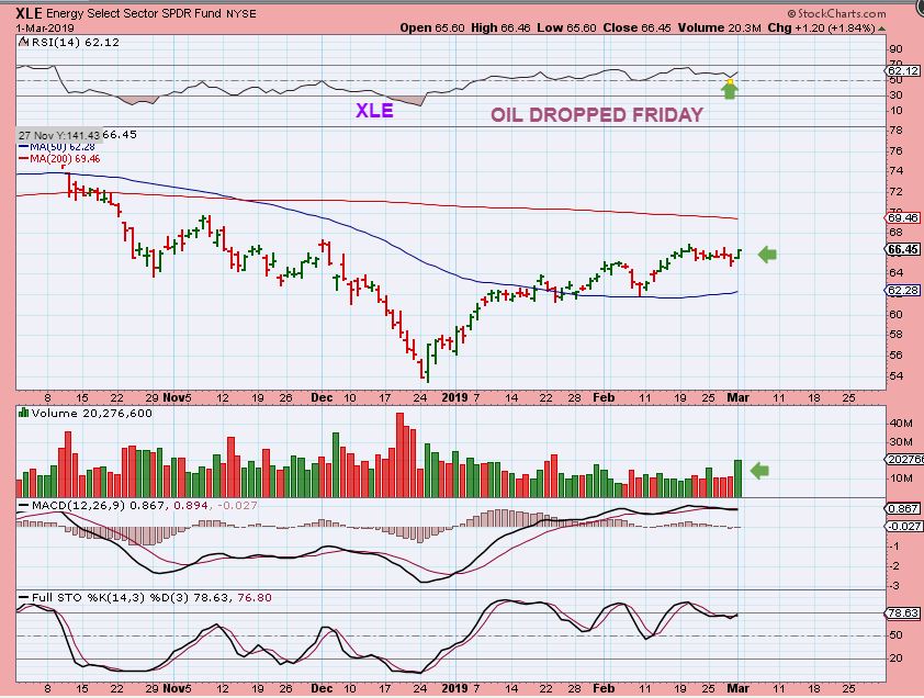
WELL HERE WE GO AGAIN– You should recall that OIL dropped 1 day and XLE Ignored it. THEN OIL popped higher on the inventory report and the XLE dropped. I mentioned that it was making me cautious, because they were not acting in harmony. Well take a look at what happened next…
.
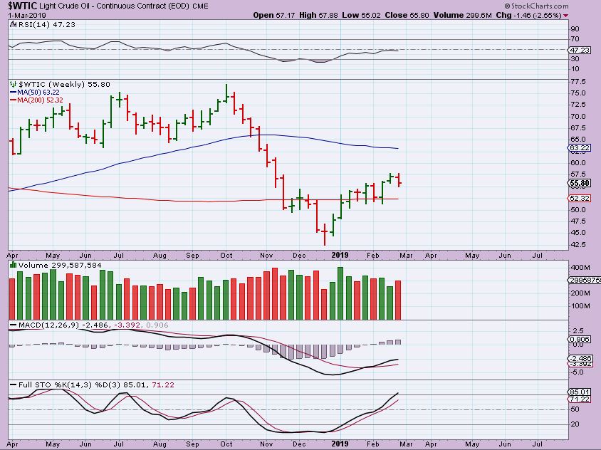
WTIC DAILY – OIL DROPPED AGAIN FRIDAY, Volume was heavy again, and the RSI is weak.
WTIC WEEKLY – SO OIL HAS NOW DROPPED FOR THE WEEK AND THAT CAN CONTINUE. Did the XLE follow?
XLE DAILY – Friday, The XLE Ignored Oils drop and moved higher? Yes, and on strong volume. The RSI curled up and …
XLE WEEKLY – That caused the XLE WEEKLY to close green for the week, reversing off of the 200 week ma. This is an obviously mixed picture.
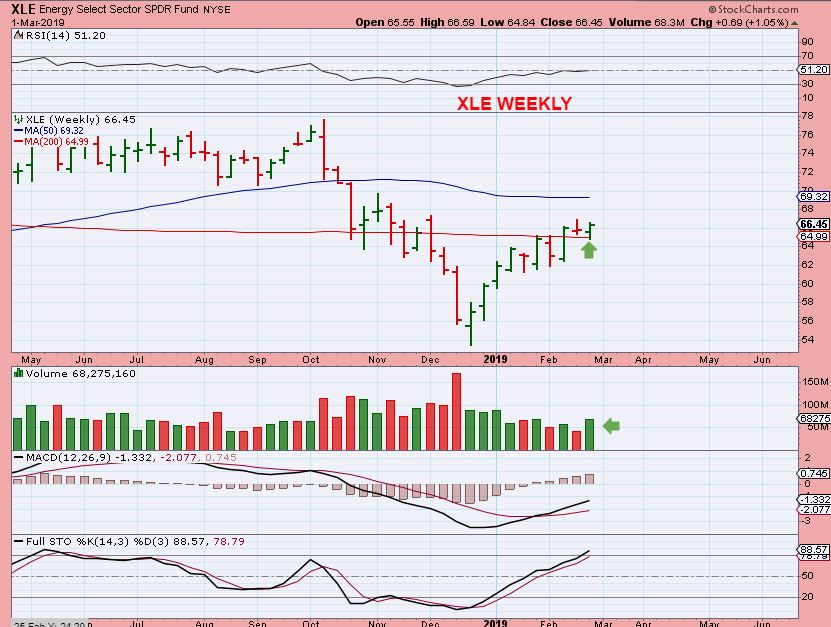
BASICALLY, THE OIL / ENERGY SECTOR CLOSED THE WEEK AS – CLEAR – AS – MUD. It remains a mixed picture.
.
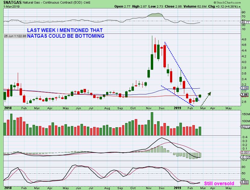
NATGAS LAST WEEK– I posted this chart showing that NATGAS had a descending wedge break out, may have bottomed, and could be bought with a stop
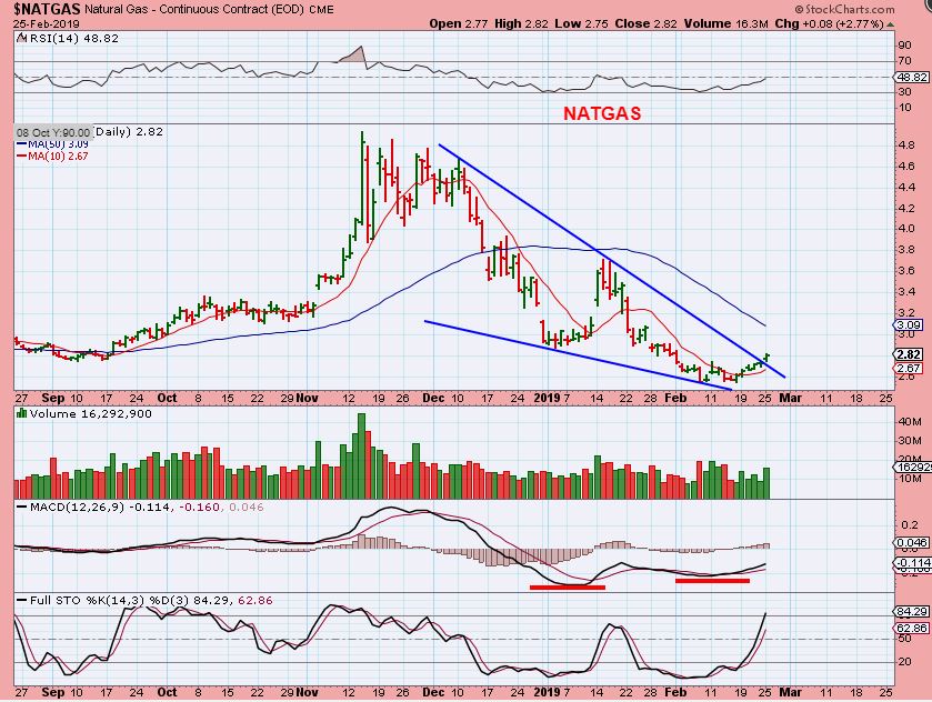
NATGAS WEEKLY – NATGAS remains the same here. It was $2.82 on last weeks chart, it is now at $2.86 ( It went sideways for 5 days this week at resistance), so it can still be bought.
.
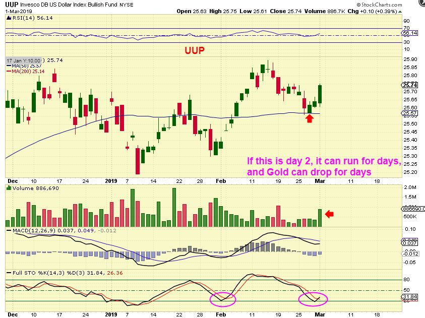
UUP DAILY – Day 2 of a new daily cycle and that was a good pop. Gold dropped.
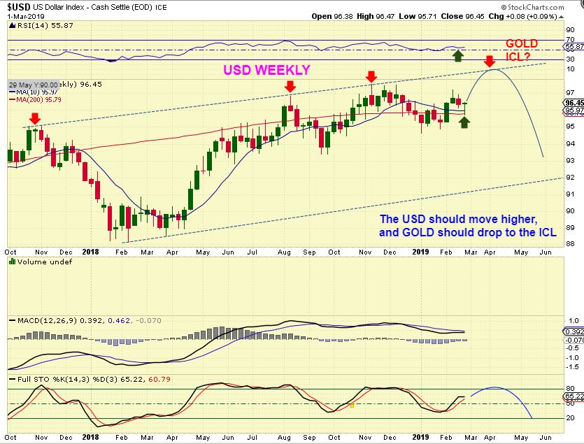
USD WEEKLY – It would make sense if the USD does rally short term, and Gold drops further. When the USD ‘peaks’, Gold may have found its low (ICL).
.
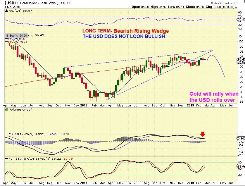
THOUGH WE SEE STRENGTH IN THE DAILY USD CHART, THE USD BIG PIC IS ACTUALLY WEAKNESS. That is good for GOLD.
.
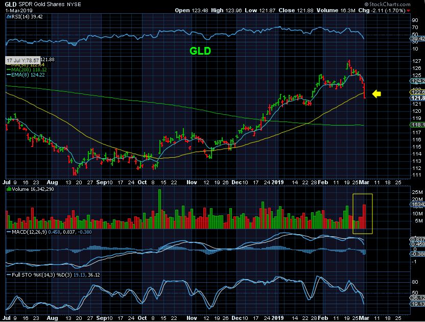
GLD DAILY – The GLD broke down Friday with high volume and closed below the 50 sma. With the USD rising, it can drop to the 200 sma. After a series of higher lows, this has broken the Feb low.
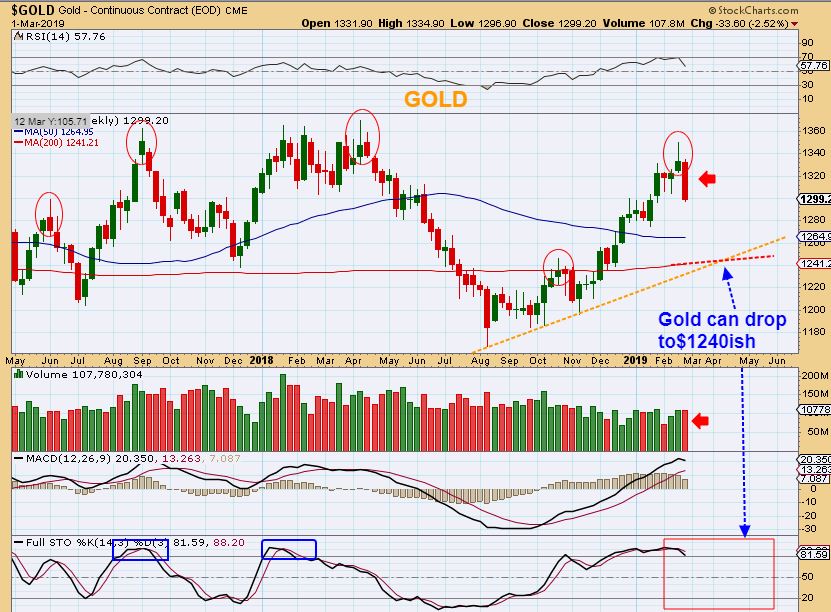
GOLD WEEKLY – Last weekend I pointed out the reversal candles, and this week we did get the follow through selling. As the USD rises, this should drop further. Notice how oversold Gold is on a weekly basis. I think that Gold can drop to support areas of $1265 or $1240.
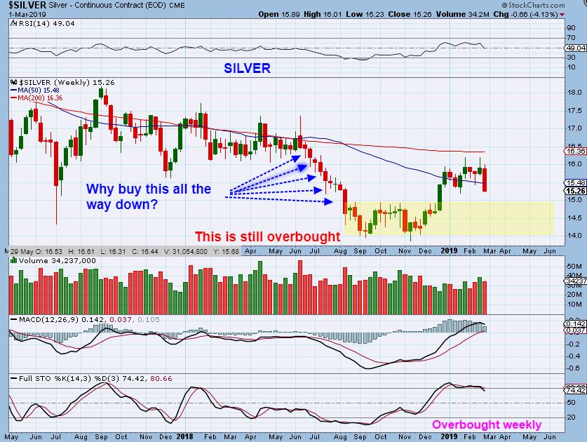
SILVER WEEKLY #1 – Silver closed below the weekly 50 week ma. A word of caution – Silver can pick up speed on the way down and often you get a Big Candle drop like this one out of nowhere. I would recommend waiting for the selling to dry up or reverse, rather than buy this all the way down. Why? Notice how that didn’t work out well last May-Aug and this is still OVERBOUGHT.
SILVER SAME CHART:
Note: I like to admonish being patient and try to wait for the dcl / ICL reversal on Silver. ‘Buying The Dip’ in May, June , July of last year never really broke even yet. Silver never fully recovered. ** Some silver stocks may hold at support, but stops are still recommended in case they break down too.
GDX WEEKLY #1 – Last week I pointed out the weekly topping candles ( yellow circles), and this week GDX broke down. I’ve noticed that in the past, GDX only broke the 200 weekly ma slightly and then reversed higher (blue arrows). That is something that we can watch as this sell off takes place. That is not a deep sell off. Also…
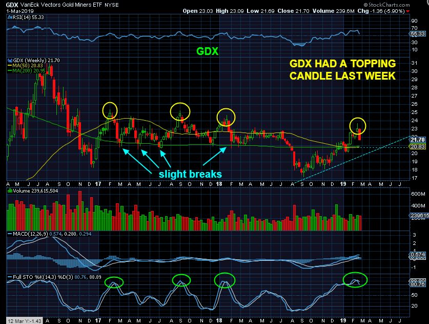
GDX WEEKLY SAME CHART – You’ll notice that we are almost there at the weekly 200ma already, so I am wondering if this just sells down & gets choppy – sideways – and bounces around at that 200 weekly ma? Or do we break down to the blue dotted trend line and then recover? We just have to let this play out for now.
.
I will have a few more observations below that I think you will find interesting. Things are looking good with a pull back in Precious metals underway. It may experience a bounce here & there, but overall you can see that this sector is overbought on the weekly charts and there is still more room to the downside. I would expect the selling to continue. We can look for buying opportunities when there are signs that the selling is drying up.
.
Enjoy your weekend!
.
~ALEX
.
** When GOLD drops into an ICL, we look for a Trend Line Break of the entire Intermediate Cycle to help us to identify that ICL.
.
– THAT is an identifying mark of a drop into an ICL, HOWEVER, I do not necessarily Marry any 1 idea, and I want to show you why. I feel that in the past, there are often ‘exceptions to the rule’ in many areas, and this may be one of those areas. We got a steep sell off in 2018, and then a BASE, and then a strong rally. IS IT POSSIBLE, that a trend line from the AUG ICL may not be broken on the pull back?? I say that it is possible , and let me show you why...
.
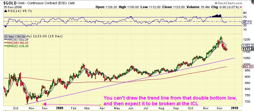
GOLD ICL DROP 2008 – Look at the 2008 Drop for GOLD. The ICL formed and it had a small bounce and spike down within a month. That is a double bottom low with a higher low. If I draw a trend line from those 2 lows, THAT TREND LINE WAS NOT BROKEN FOR WELL OVER A YEAR. Read the chart…
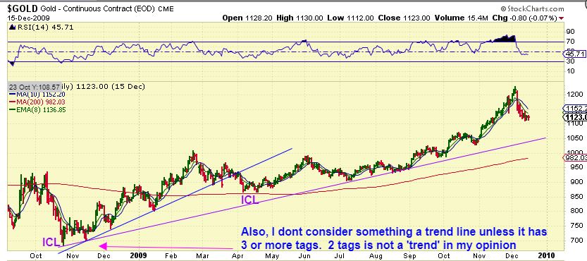
SAME CHART – GOLD ICL 2008 : So I just drew a trend line of common lows along that whole intermediate cycle (blue line). The trend line had to start with the 2nd low after the ICL ( the higher low) . THAT trend line was broken on the drop to the ICL as seen here. Read the chart please. The other supporting trend line became a longer term trend line after a year, so I used a shorter term trend line ( 6 month). What does that mean currently ?
GOLDs CURRENT ICL DROP – When I draw a trend line (Yellow) from The August ICL , October low, & November low, it leads to what looks like less than a 45 degree angled line. CAN WE ACTUALLY DROP DOWN AND BREAK THAT YELLOW TREND LINE? YES WE CAN, but because of what I showed you on that 2008 ICL, is it necessary or is the Blue Line the trend line? That is open a fair question, so…
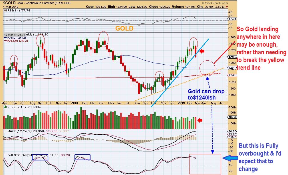
CAN WE BREAK THE YELLOW TRAND LINE? YES WE CAN, but if we get a strong reversal above that line on the 200 or even the 50 weekly ma ( red circle), I may conclude that waiting for a trend line break could cause us to miss the low. We are very overbought right now, so I do expect a deeper drop and there is time to watch this. I’ll just watch & see how it plays out, but I just wanted to share with you that I am also keeping 2008 in the back of my mind.
I will be looking at a list of other clues too, as that time approaches.
.
GOLDS BIGGER PICTURE ‘VIEWS’
.
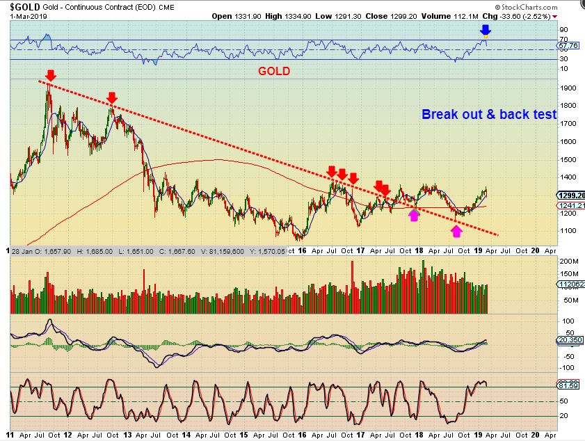
GOLD BREAK OUT AND BACK TESTS = This big picture is Bullish as a break out & back test. Buy the dip at the ICL.
ANOTHER GOLD BIG PICTURE VIEW – Look at the bull run of 2000-2012 and you’ll see that the ‘stochastics’ DOES sell down from overbought at ICLs to the 50% or even to the 30% level. When it goes through a period of a steep ramp up, it may only drop to 70 -80%. So that is something else that I am looking at.
.
THE SAME GOLD BIG PIC VIEW – Notice that both our current rally & a possible pull back here will look small in the Big Picture. A drop as drawn here near $1260 would make a great ‘buy’ if Gold now breaks out & forms the giant cup.
LET’S TAKE A LOOK AT THE LITTLE ROCKET SHIP ‘AU’
.
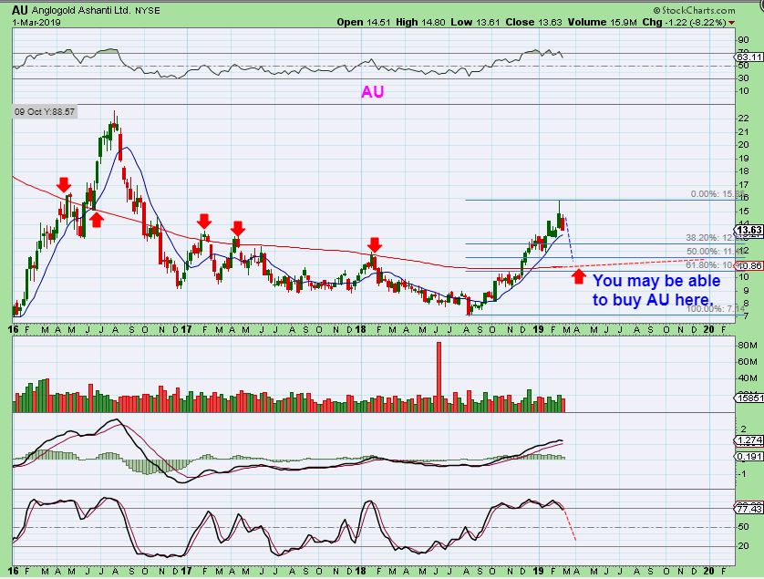
AU DAILY – So we watched AU run from $7 to $16, a very steady climb higher. I did have some ‘Buy’ recommendations along the way after it consolidated gains near the moving averages, but personally I did not trade this one. So AU looks great, but it just peaked at $16 and dropped to $13.60 this week, and I think you’ll find this interesting…
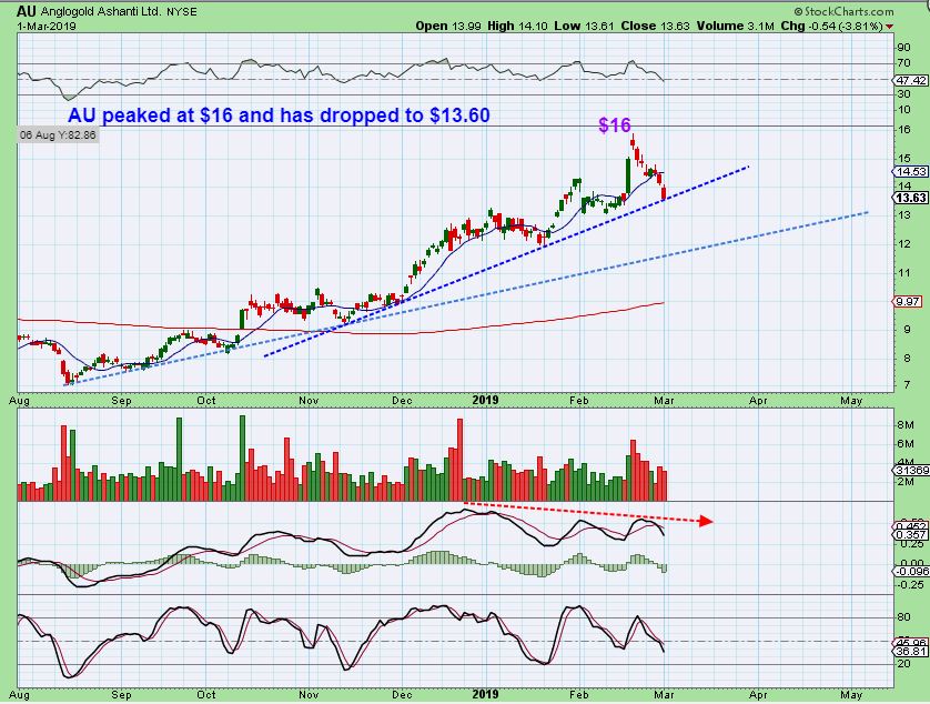
AU WEEKLY – The weekly chart shows that it could possibly drop as far as the $10-$11 area. It already peaked at $16 and dropped to $13.61. It is still overbought on the weekly chart, so it can drop further. There is more that I wanted to show you.
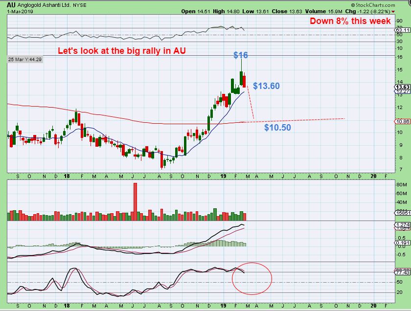
AU WEEKLY – Look at the run of 2016 and you can see that this current run is smaller and would be about 1/2 way there. A drop to $11 at the 200sma and then run to $22 would do your account good- 100% gains! The 2016 run kind of makes this run look small, but there is still more…
AU WEEKLY BIGGER PICTURE – Really take a step back and now the 2016 Run even looks small and the current run looks tiny! This could actually be 1 giant base. This is the Big Picture perspective of potential gains in a bull Market. How does $10 to $60 sound?
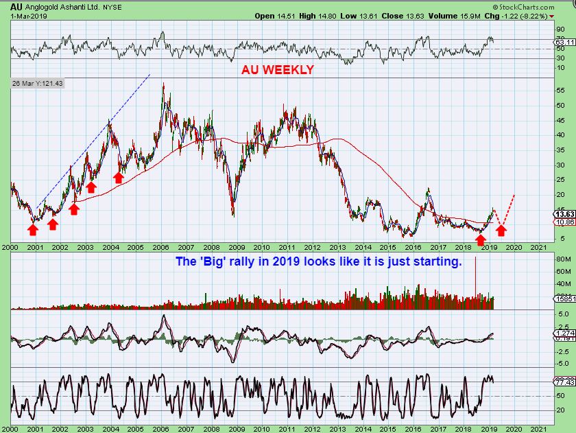
The above Chart should help us all to see that even the nice run that stocks like AU have had recently may only be the beginning of what the bull Market can bring our way. The above chart should give everyone a sense of Hope, because we have other stocks that are still setting up and ready to go too. If this is just part of a base, the gains will be excellent. Again, that recent 6 month run now looks tiny by comparison. Be ready to Buy – The – Dip. 🙂

